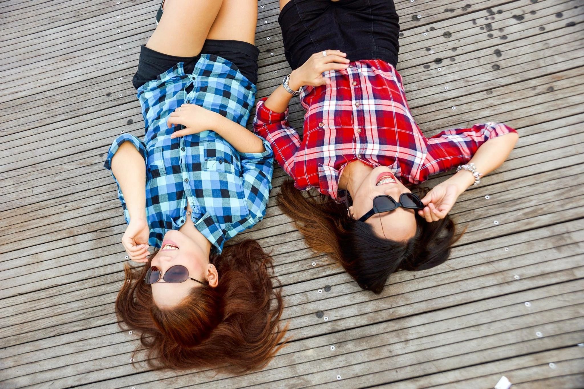
Are you tired of the family photos where everyone is in matching red polo shirts? You may want to check your closets again, because styles have changed since that tradition! Instead of trying to match the same color on every family member, why not put them all in colors that are either in the similar hues, complimentary, or no correspondence at all!
Some examples of each are:
Similar hues: Soft or dusty colors, vibrant colors, neutral colors
Complimentary: Colors that are opposite on the color wheel like blue-orange, red-green, purple-yellow
No Correspondence: This doesn’t mean have one kid in a church outfit and another in a swim suit, the idea is everyone should be dressed similar in style such as all dressy or all casual, but lots of color variation
So with your next session, avoid the “everyone in a denim shirt” theme and choose either similar or complimentary colors! Chances are, you’ll love not matching!


")

")